You can help determine which cover we use for the next McKenna Mystery! Vote for one of the following two, or leave a suggestion if you think we’ve missed something. Cast your vote in one of two ways. Leave a comment below with “Cover 1” or “Cover 2” in the text. If you’d prefer to vote on Twitter, use “#bibcover1” or “#bibcover2” (that’s the hashtag followed by the acronym of BIB for Big Island Blues followed by “cover1” or “cover2”). We’ll watch on Twitter and collect the votes at the end of the week.
Everyone who votes will be entered into a drawing for an e-book version of Big Island Blues!


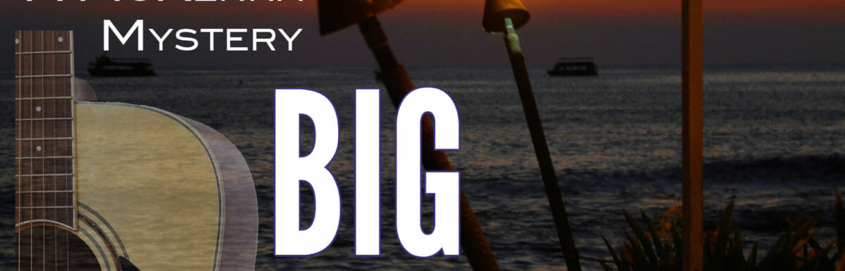
My vote is for cover #2. It is more consistent with layout if first 2 covers in series.
I prefer #2. Just looks more readable and balanced.
I really like the Cover #1 better. The text is far more readable and the items are more visible and eyecatching. I like that the author’s name is visible but it doesn’t overwhelm the title.
I voted for # 2
I prefer cover two. I like the author’s name on the bottom of the cover in bold letters.
Cover two. I like seeing the ocean and getting a feel for where it is located.
Hi Terry,
I prefer the second book cover. It highlights your name and the book title better.
I prefer cover #2. It’s more balanced.
I like the first cover. It looked better. I was able to see more of the cover. The proportions are better. I like where your name is and how it stands out.
I don’t know why, but I like cover number 2
Cover #1
I prefer cover # 2 and I tweeted it.
I like Cover #1 better. Grabbed by attention better than cover 2
I definitely prefer cover number 1.
cover one. grabs my eye faster. I got title and author in one glance.
Cover#1
I like the second cover. It doesn’t look as crowded. I might lighten up the background a smidge to make it more appealing.
I concur, I like the second cover (but think the author name should be at the top, lol)
I prefer the second cover as well. I also think the guitar is too large (although I love them).
Thanks to everyone who’s voted so far and especially to those who have left insightful comments. I’m looking forward to seeing what else we hear! Mahalo!
I like Big Island Blues Cover 2 . It is an eyecatcher. The first one is ok but the guitar grabs your attention first taking away from the A McKenna Mystery.
I like cover 1 it seems to flow better.
I prefer #2 where the guitar is not as over powering. The title comes to my eye more easily, leading to the author line.
I like the 2nd one.
I vote for #2. It is arranged in a better manner.
I like the second one.
2nd cover, but the word Island is hard to read since it is a dark color. Can you make it lighter?
I prefer the second one.
I prefer cover #1.
I really like the second one!